Let’s start this journey
“How can we recognise members and make them feel more attached to the products they have already purchased?”
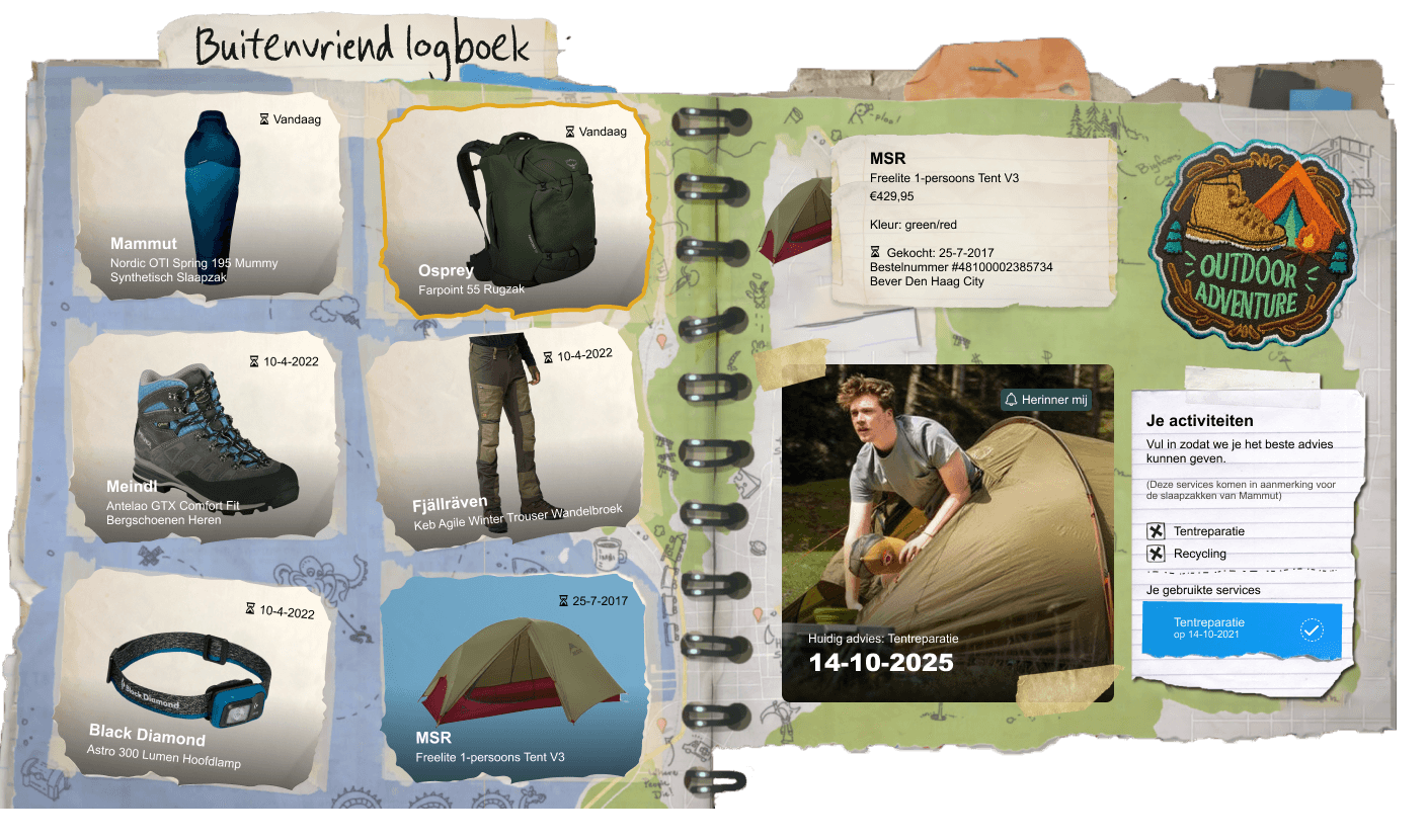
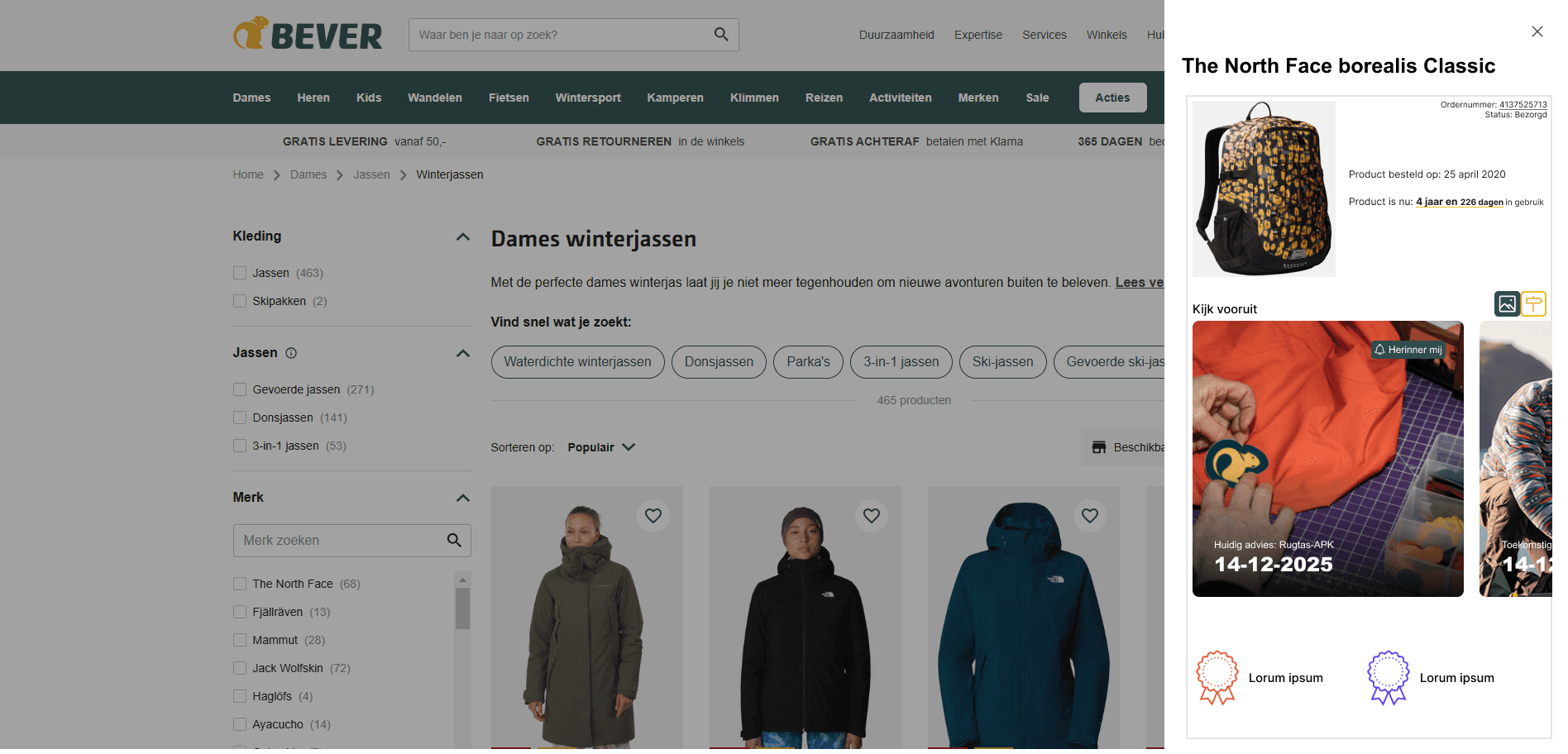
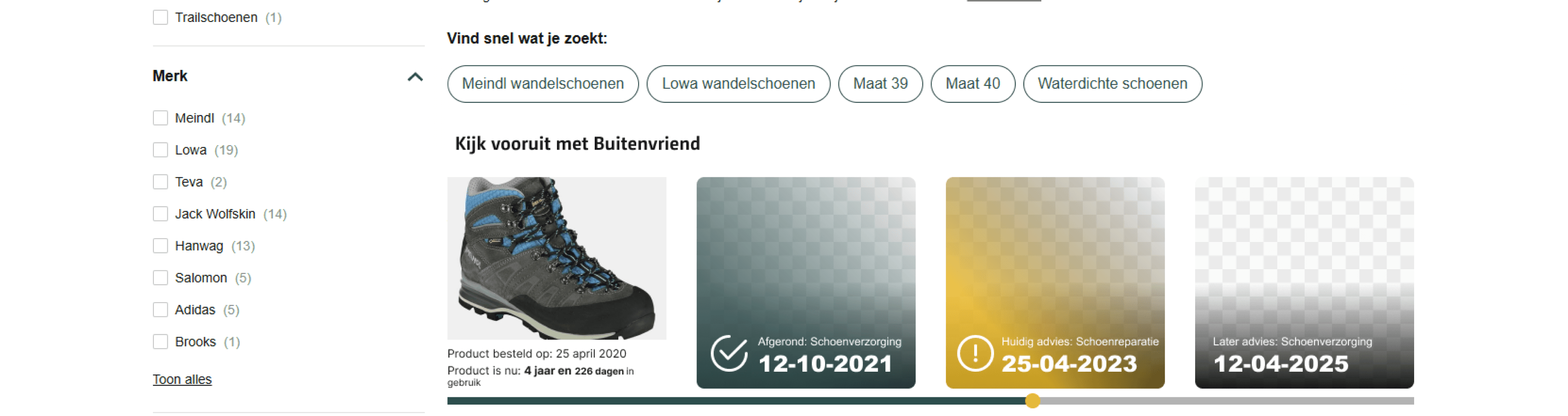
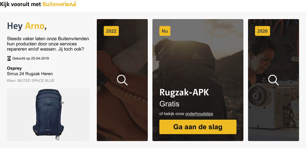
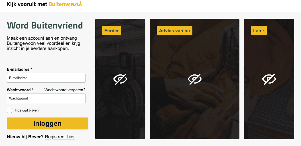
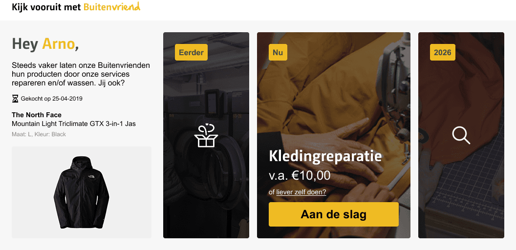
Kijk vooruit
met Buitenvriend
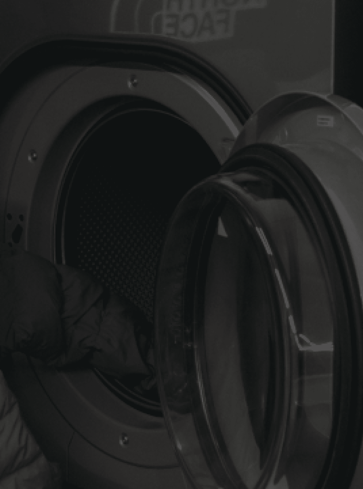
Outdoor gear lasts a very long time which makes it the perfect angle to increase retention of Bever's loyal members by providing them with a timeline with all the recommended services and maintenances.
Motivation & context
The client
Yonderland (the parent company of Bever) wants to raise the customer retention of their loyalty program.
Learning to create feasible ideas
By working closely with an UX-team I aim to improve myself with refining fun concepts into feasible ideas.

Specifying the goal with the client and target audience
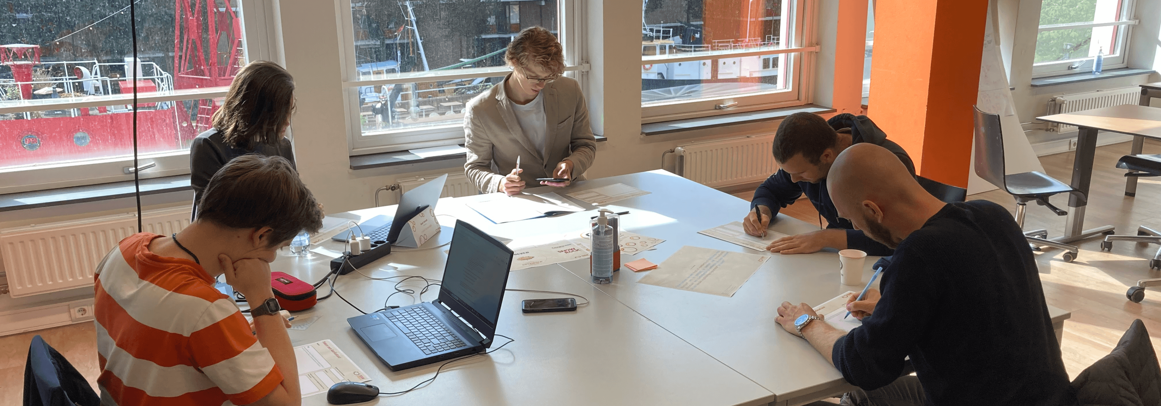
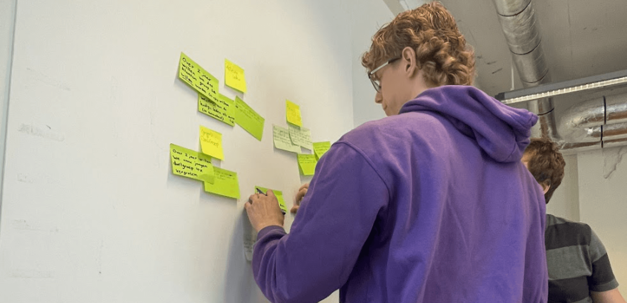
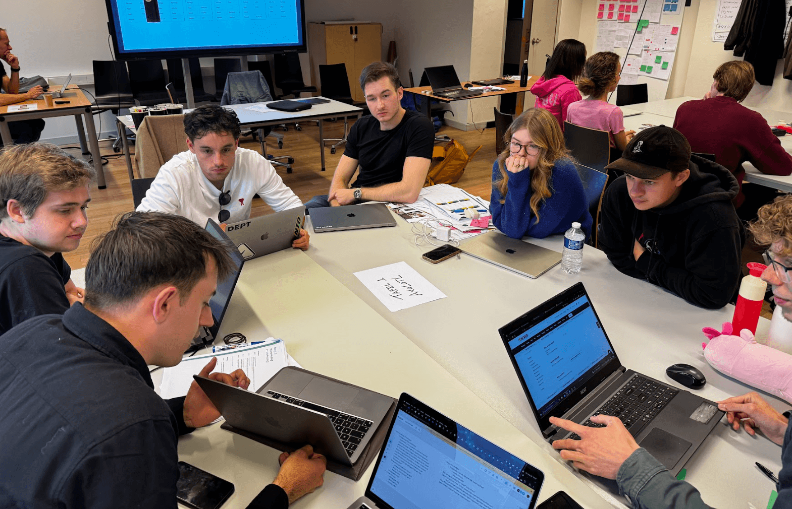
A workshop with the client
The goal of the workshop was to debrief and discuss various focus points of the design question, such as the design goal, the target audience, the client’s online market and their loyalty program. By the end we aligned our wishes and demands that set up our team for a much clearer road ahead.
The workshop. (L-R: Steven v/d Beek, Noah Verkaik, Stefan Haaring (me). Stef Rullens (UX Designer) and Peter Smit (Productmanager E-Commerce)
Key insights
Outdoor people between 35-65 with an account who value sustainability
About the target audience
A digital touchpoint that stimulate the usage of their services
About the desired situation
To reactivate the 74% of accounts who forgot they are a member
About the goal
Interviewing outdoor lovers
The key insights about the target audience and the goal turned into three important themes to expand the research on.
Screener
Who are 74% and what makes them, but more importantly, who are the 26% with no problem being an active account?
Expectations
How are loyalty programmes perceived of both competitors and Yonderland?
Opportunities en painpoints
How do they apply loyalty programs in their daily lives and what may break or make it for them?
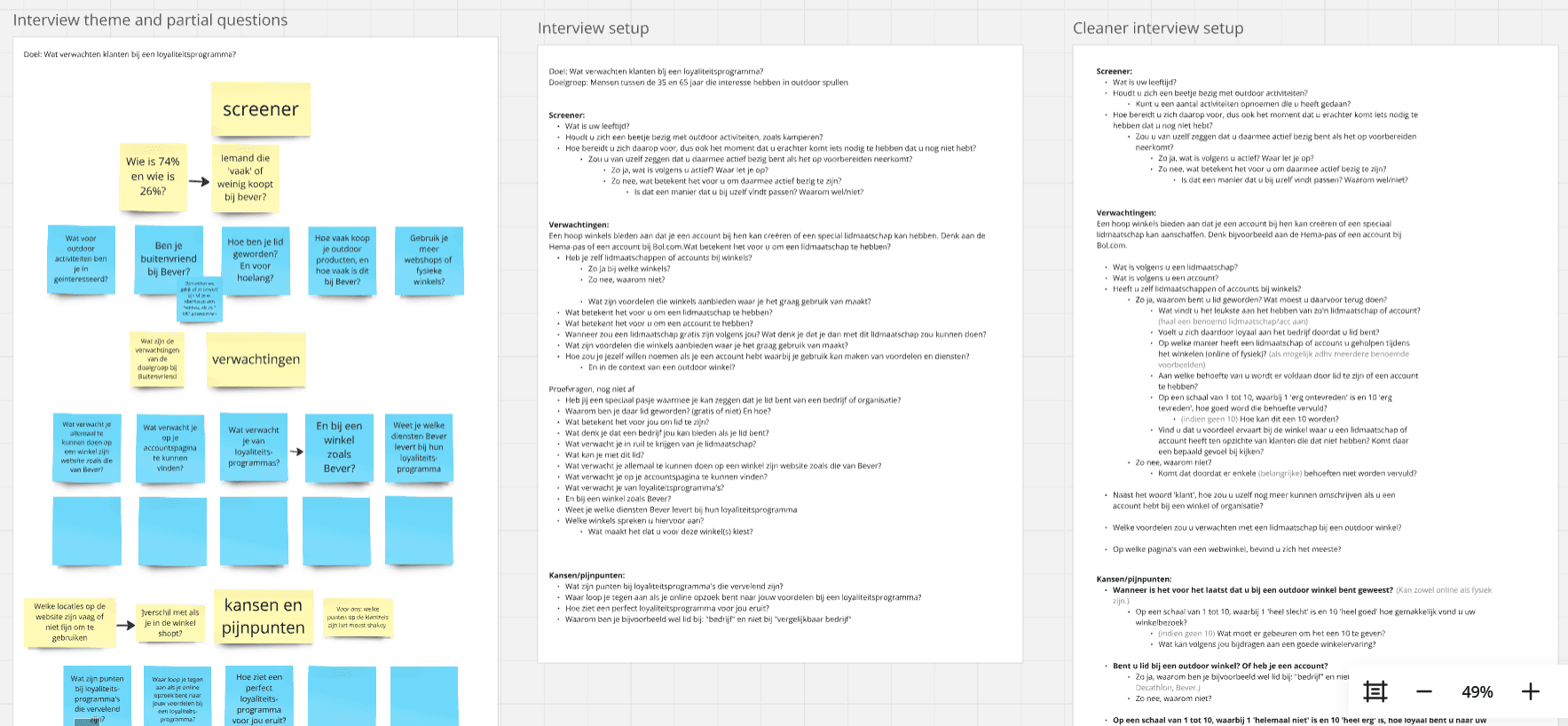
Development of the interview plan from outline to a defined layout
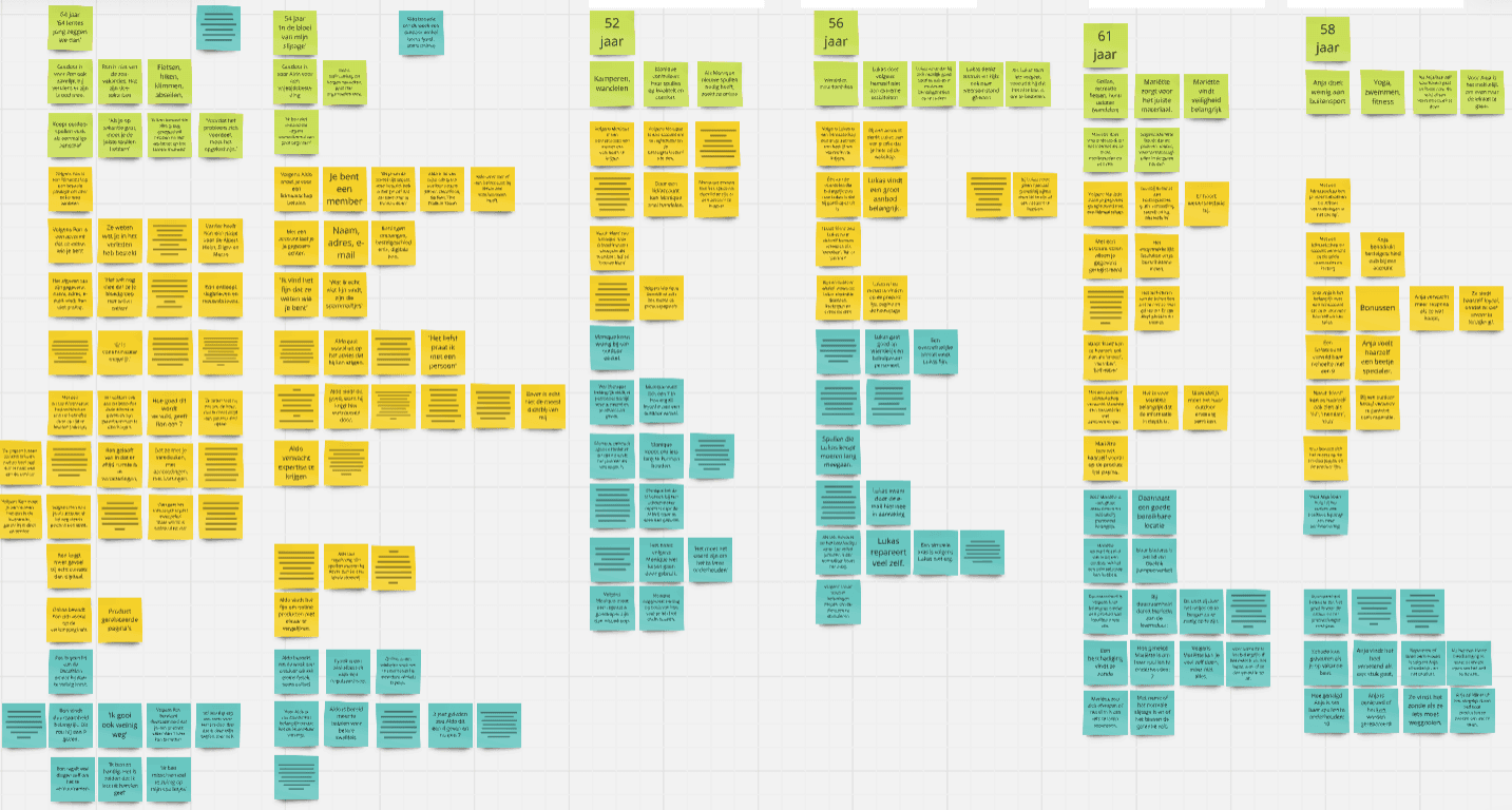
Categorised interview insights
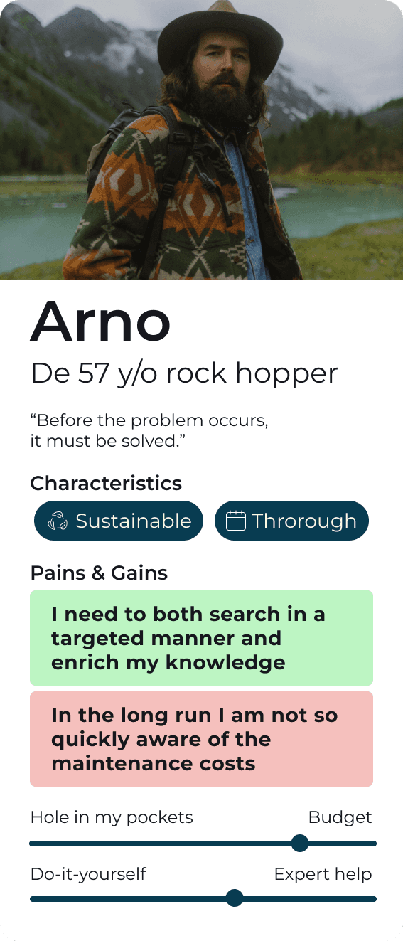
Fig. 3 | Persona about the target audience
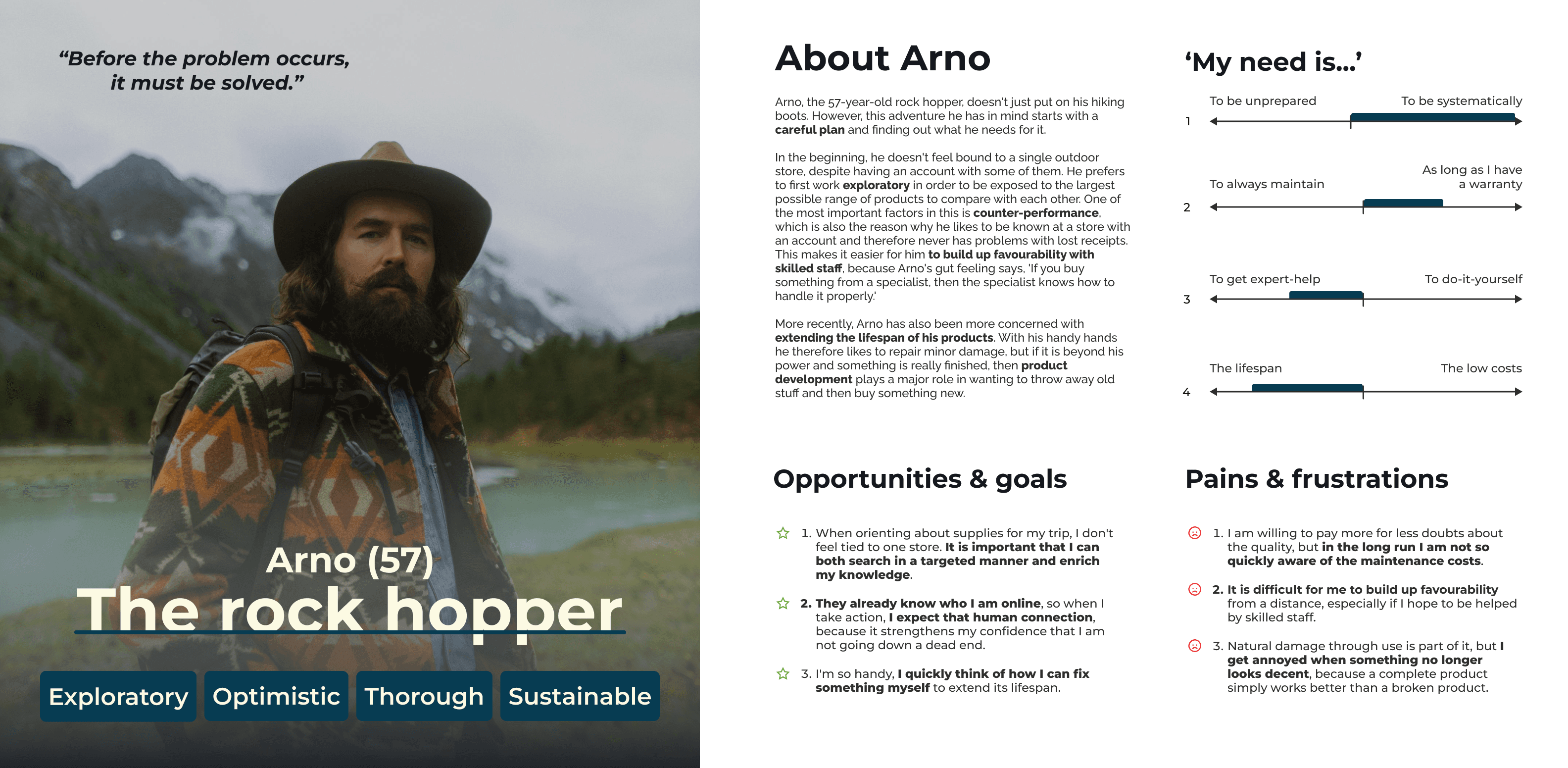
Key insights
I need to both search in a targeted manner and enrich my knowledge
Needs & Goals 1
‘My need is...’ expert-help from skilled staff to build up favourability
Likert scale + the Ábout Arno’
In the long run I am not so quickly aware of the maintenance costs
Needs & Goals 1
“How can we define a digital touchpoint for customers to engage with Yonderland’s services to increase customer retention and gain more value from the local loyalty program?”
About the design question

research phase

the finishline
Design result
Product Listing
Page (PLP)
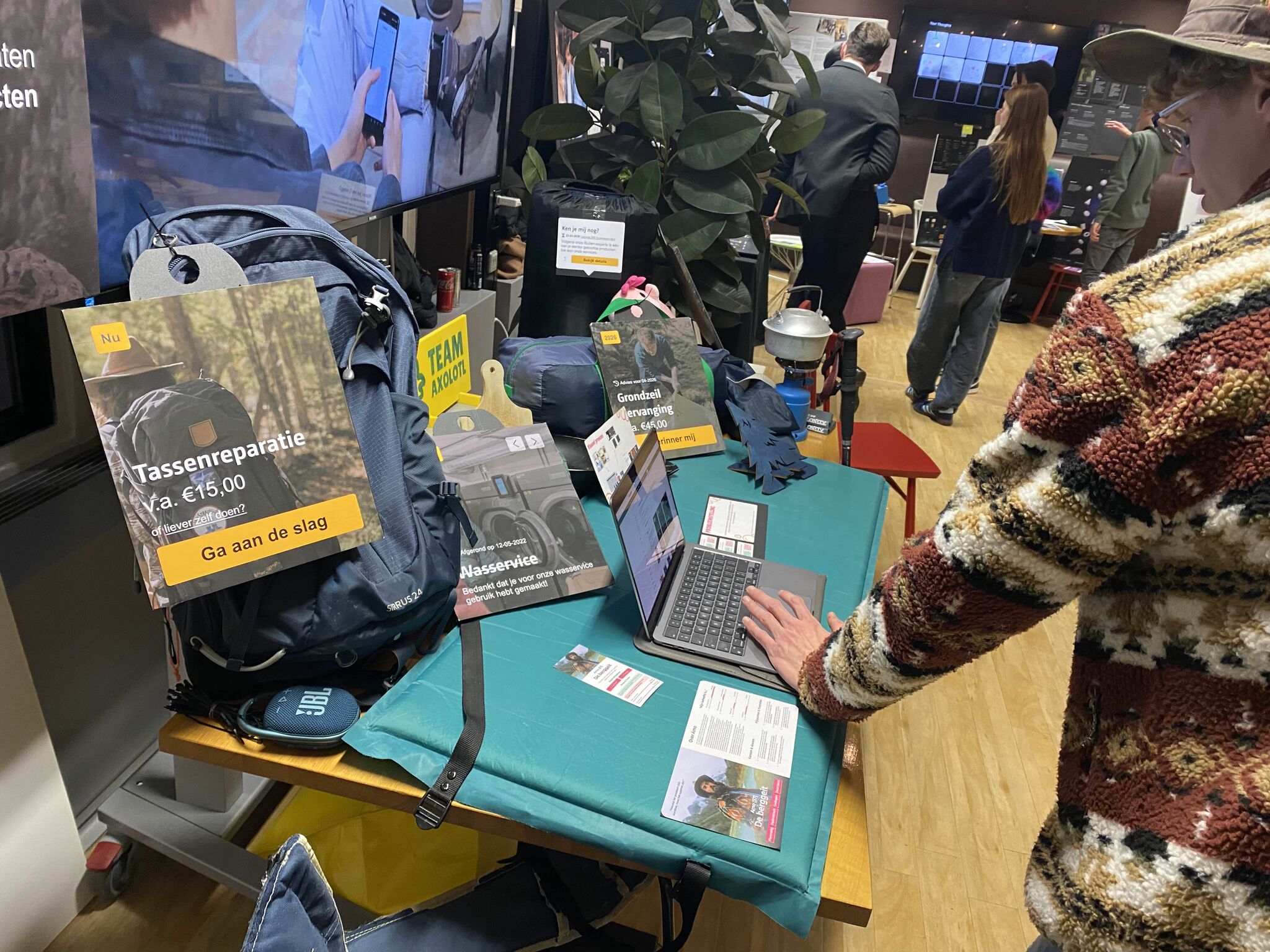
A personal timeline
of services
!
Problem statement
Although many of our customers have registered for our loyalty program, the brand affinity and engagement of these customers is decreasing.
Goal statement
To define a digital touchpoint for customers to engage with our services to increase customer retention and enhance the benefit of our local loyalty programs.
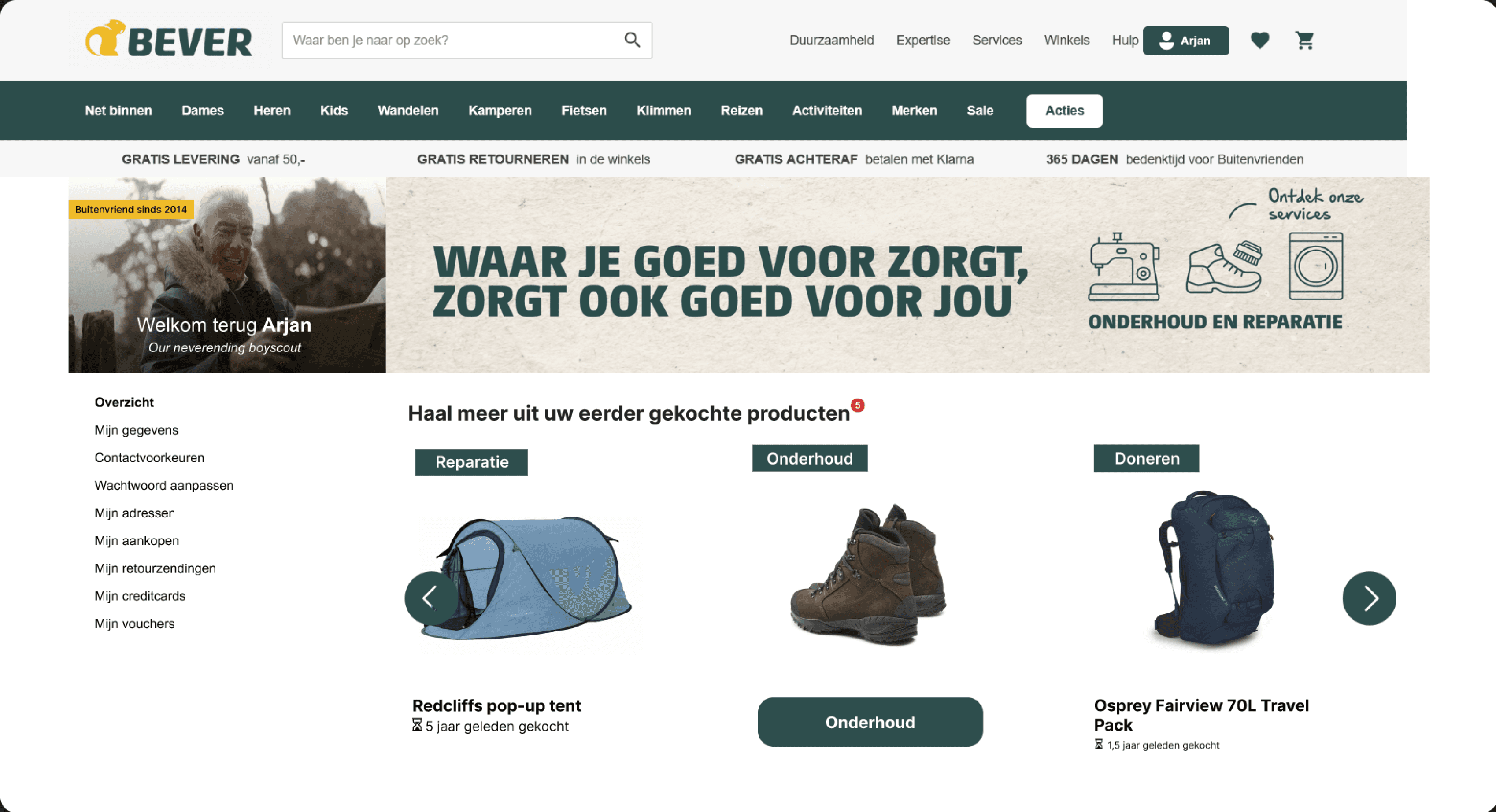
Memberships + order history + services
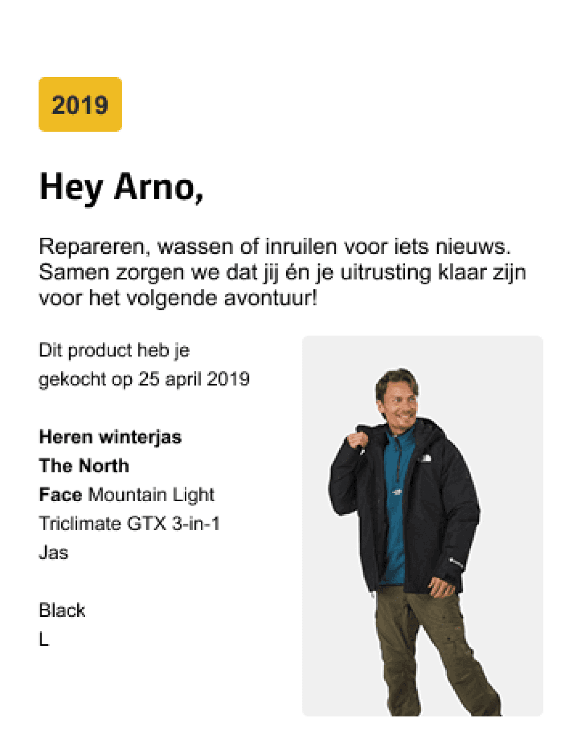
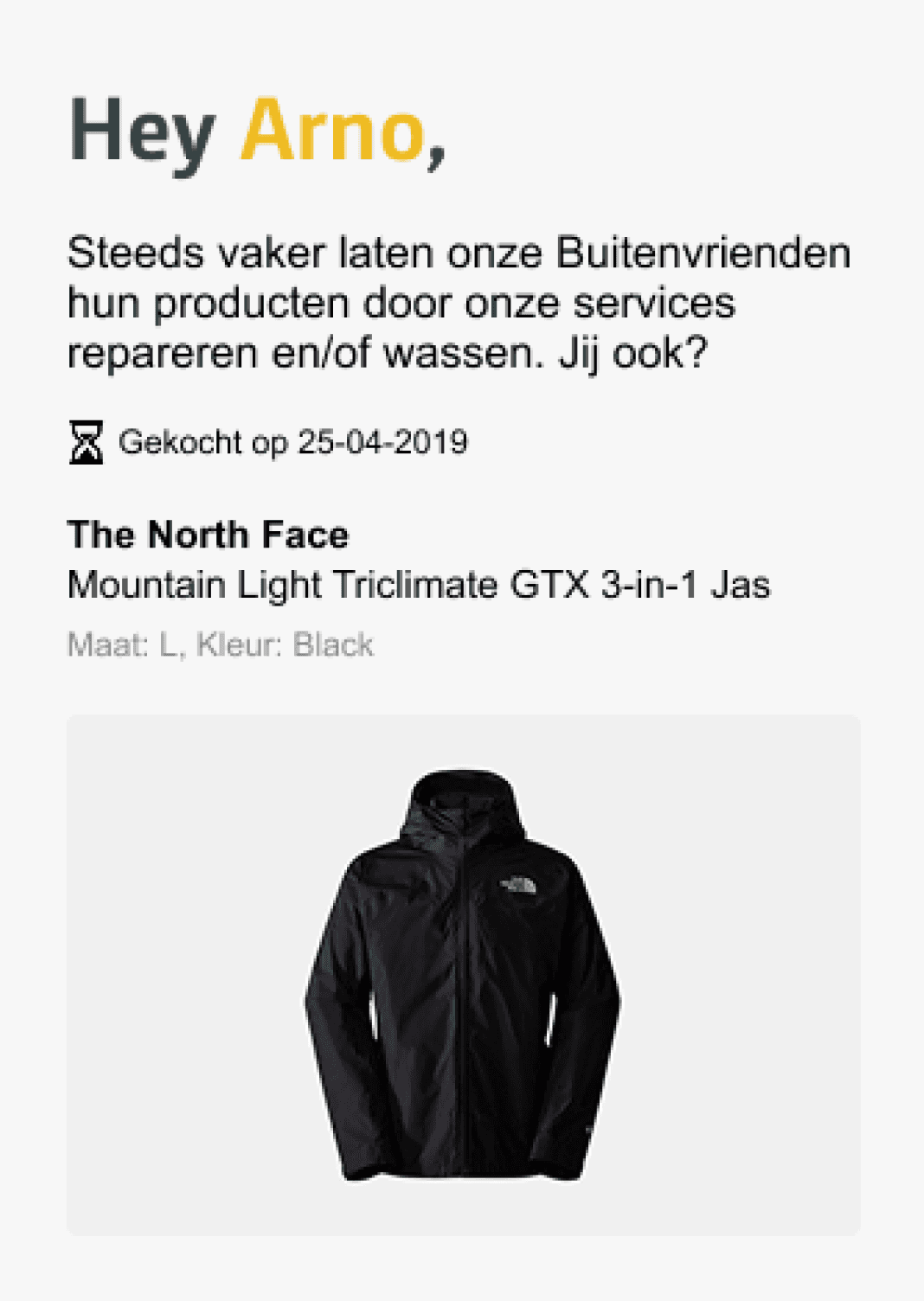
2019

Advice for
Panel replacement
v.a. €45,00
Get started
2022


Completed on 12-05-2022
Laundry service
Thank you for choosing our laundy service!
Now
Clothing repair
from €10,00
or try it yourself?
Get started
Hey Arno,

Responsive from left → right
Design sprint
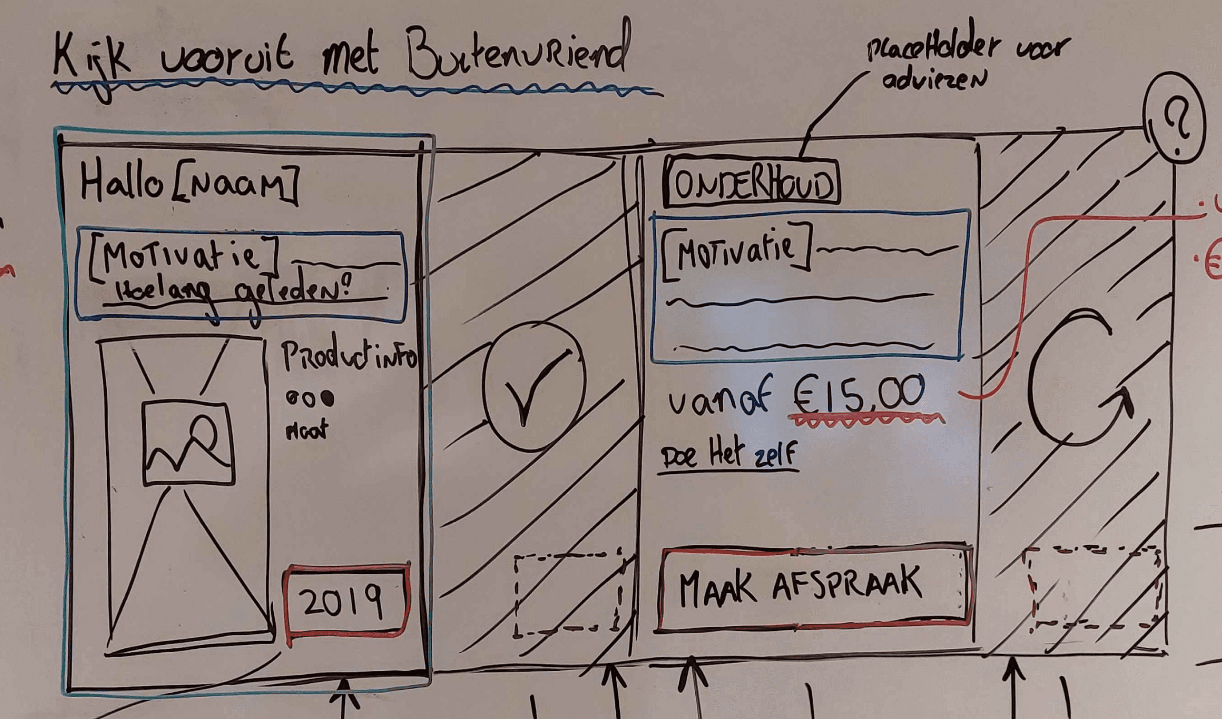
A design sprint this early into the phase is meant to bring forth good and bad directions in relation to the wishes and demands of the client. Within the team I took upon myself the role of the facilitator and thereby made sure we kept to the time and wasted none. At first we turned the design question into a Long Term Goal.
“In two years, customers will be able to apply the benefits of the loyalty program to their customer behavior at Yonderland on their own initiative.”
Observing real store experience
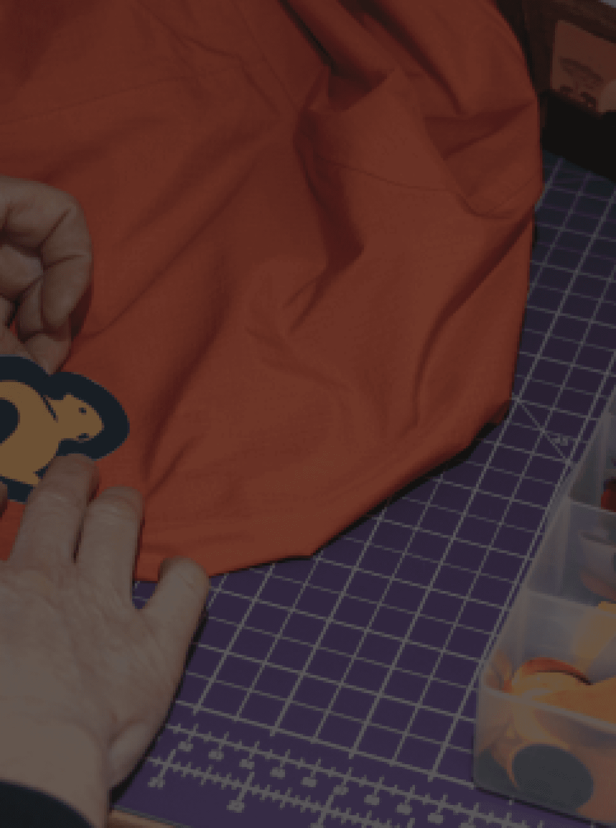
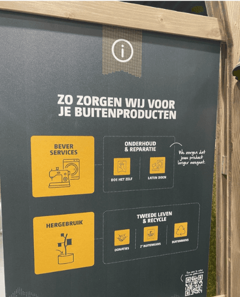
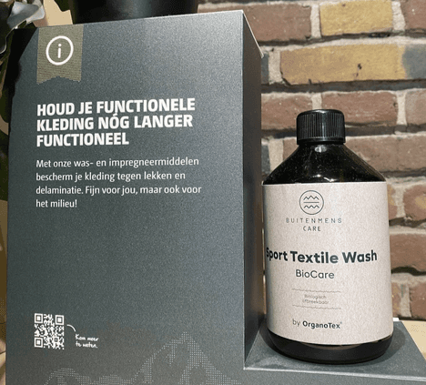
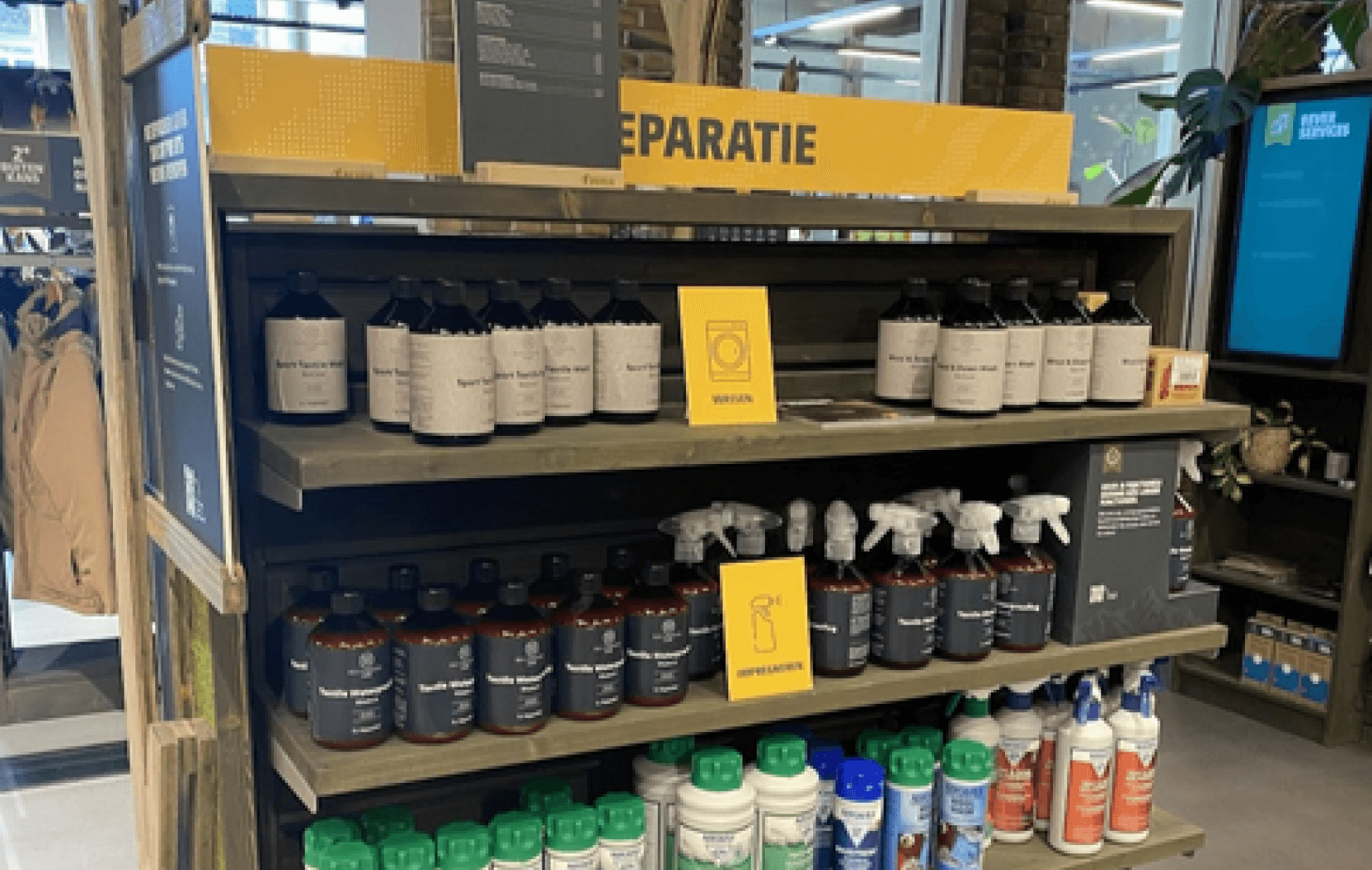
According to the target audience they favour the real store over an online stores. An expedition to a Bever store found that services and products go hand in hand.
Solution sketches
Make customers feel attached to the products from their order history.
The Solution sketches where focused at how we can bring the services as much to the front of the page as a real store does?
This lead us to the following principle that became the centre point of the project:
Prototyping
A new
member-hub
Supported by being reconnected with old purchases from way back
Recognised to be validated as a member with which comes with benefits
Too confronting to see an order history on the front page of your account
Forced to keep up with the maintenance of old products
We love the idea of using the product history, but what customer willingly goes to their account page?
Try to bring this concept to the flow of the buyer & seller relationship
How did respondents feel?
What did the client say?
Concepting
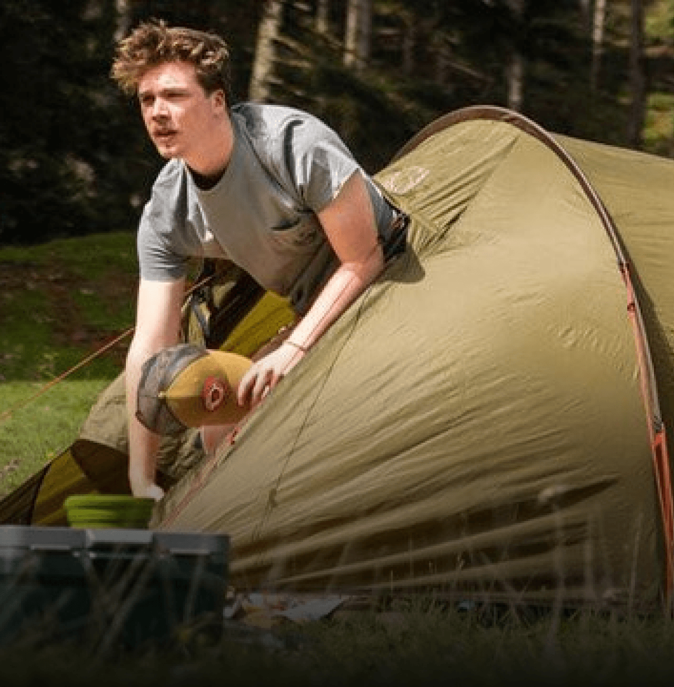
A product logbook
You will never forget your roots with this immersive outdoor logbook while all the same being awarded with badges, updates and most of all reminders for when maintenances are recommended by the experts in the field.
Client notes:
“Too big to apply on mobile and other.”
“I would be very careful with text on images if I were you.”
“The badges are a great
use of gamification.”
“No pop-up!”
The goal is to make the members interact with this. Make this the concept.
14-10-2025
Huidig advies: Tentreparatie

Herinner mij

A frequent pattern
So far, overlays where a frequent pattern on all the online stores, which could have made for a recognisable feature.
However, it was not unique or self-deteminently placed in the flow of the customer’s interaction with the PLP.
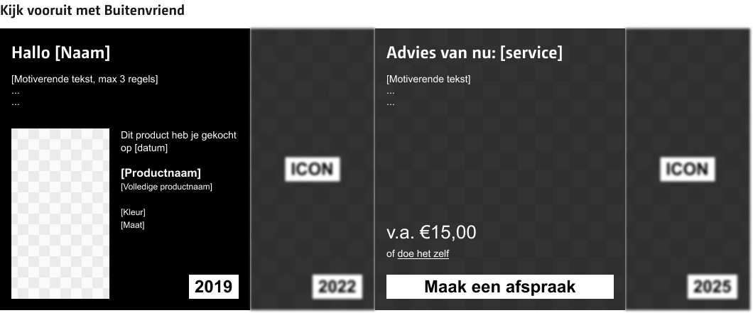
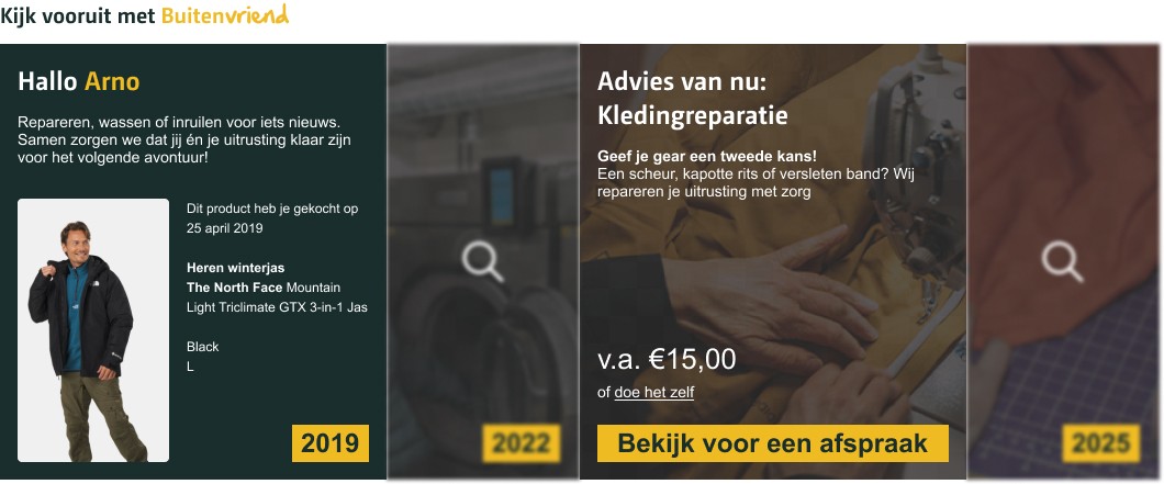
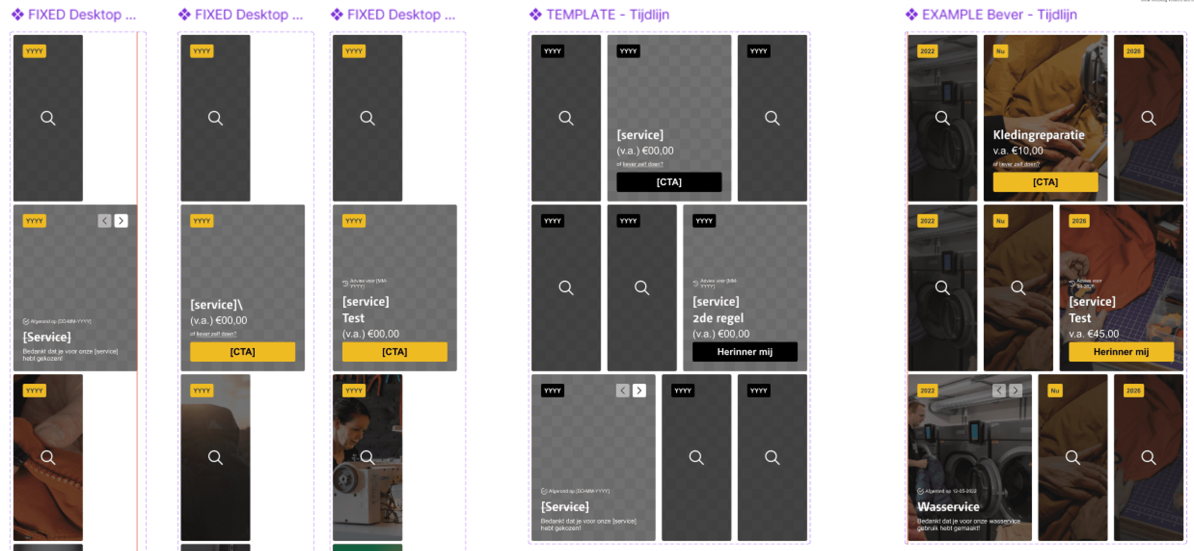
Decisively, I reiterated a variant that would fit the existing framework & layout of the PLP. I named it “The “Timeline”.
The timeline concept
Should improve
The hierarchy in text and symbols.
Focus on the ‘now’ and lesser the ‘past’ and the ‘future’.
The green line now feels detached from the rest.
Resize the image to fit the frame.
WCAG's contrast rules with images and text
Needs to be added
The Call-To-Action
Account recognition
Is already good
The use of the cards that indicate the advice.
Evoke emotion by indicating how old your product is.
The slogan ‘Kijk vooruit met Buitenvriend’
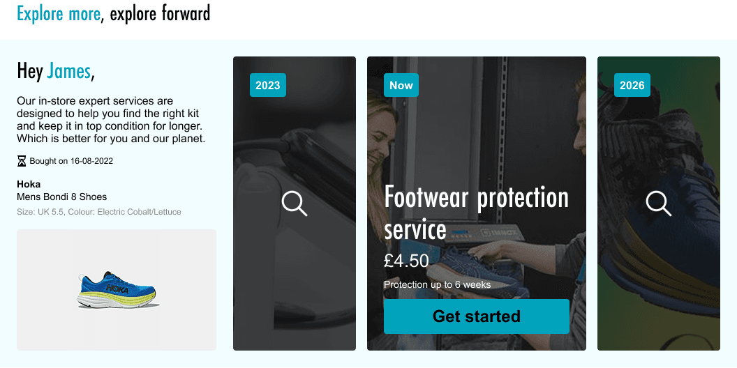
The timeline shows up whenever your account data recognises already bought items from the same catagory. During your time on the PLP you’ll see the progress that's been made, such as completed services and other advice that may be of help.
5
3
4
1
2
Being
sustainable
has its budget
I’d rather not
be taken aback
2
1
I found out that some points made with the first persona started loosen and detache from the direction of our current goal. A smaller and more comprehensible persona should help highlight what truly matter now.
Persona 2.0
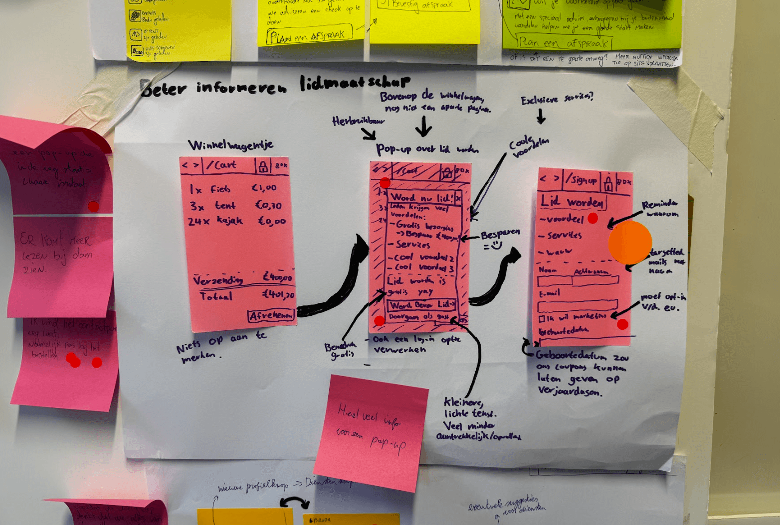
Wireframing
Design musts
According to the persona 2.0 and feedback on previous concepts, the final design must answer the following:
Which product is it about?
Where are you in the timeline?
What is the motivation?
What are the costs?
Does it regard the loyalty program?
The goal is that these five must be clear within 5 seconds of encountering it on the website.
Clear focus points,
now add colour
Visual designer:
No urge to
interact with it
Quick tests:

It is getting there,
but we need more help.
Our team:
Updating the client
“As a client I like where things are going. As a UX’er you should use your whitespace wisely, refine the hierarchy of the smaller contents and avoid repetition
in information.”
Feedback from the UX Team at Yonderland
High fidelity prototype
I improved my ability to set up a design system. This way my teammates could easily fill in content and make it applicable for Yonderland’s different brand identities.
The long awaited result!
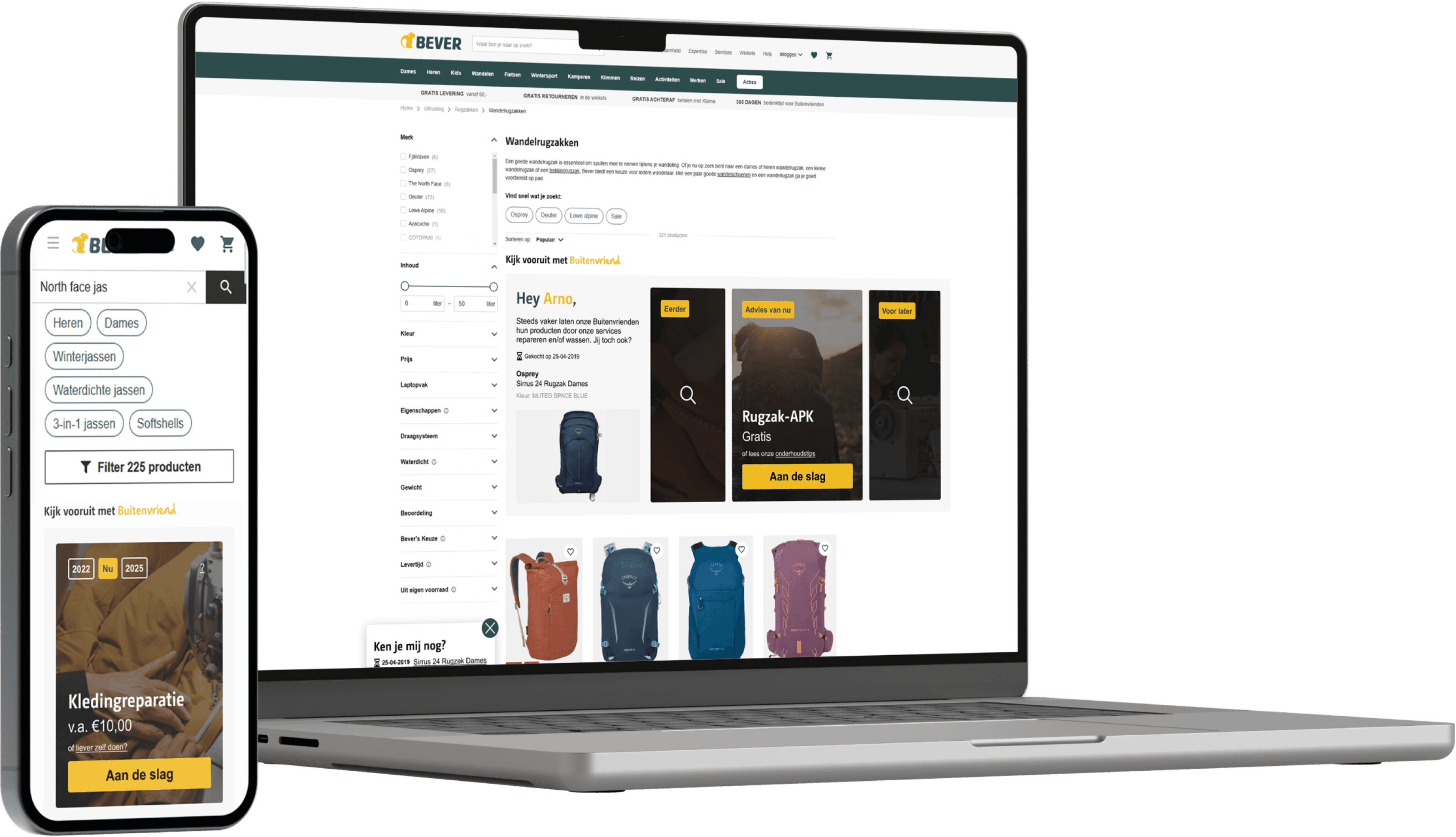
Product Listing Page (PLP)
Member or not, data shows visitors mainly enter the site via the PLP.
Reasons being that the target audience mainly searches with relevancy to their products or needs.
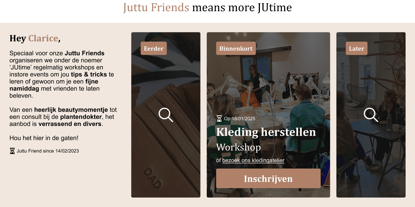
Variants
Client’s praise


“A noteworthy concept that offers a lot of inspiration in the future approach to our loyalty systems”
UX Team at Yonderland
“Throughout the previous 6 months, Stefan proved himself to be a hardworking, detailed and thorough teamplayer. Truly an inspiring designer whom will aim for the stars.”
Stef Rullens (UX Designer at Yonderland)
Hierarchy
Readability
Avoided repetition
Purchase date + symbol
Product information
Image fitting the frame
Improved:
design phase
Designing feasibility for the client
ideation phase
From fun to feasible